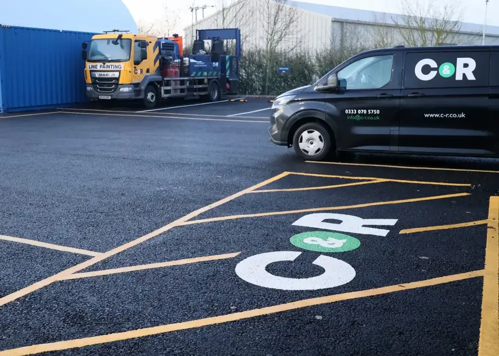

Walk into a well-run warehouse and the floor tells you how the space works before anyone says a word. Yellow walkways, red zones around fire equipment, white vehicle lanes, hatched exclusion areas. The colours communicate instantly.
Walk into a poorly planned one and you'll see random colours that don't relate to each other, markings that mean different things in different areas, and people ignoring the floor markings entirely because they've stopped making sense.
"How do you choose a colour scheme that actually works?"
It starts with understanding what each colour needs to communicate and then applying it consistently across the whole floor.
Why colour matters in a warehouse.
A warehouse is a shared environment where forklifts, reach trucks, pallet jacks, and pedestrians all operate in close proximity. The margin for error is small, and the consequences of a collision can be severe.
Floor markings are one of the primary ways of managing that risk. They define who goes where, what areas to avoid, and where the boundaries between safe and dangerous zones sit.
Colour is what makes this work at speed. A forklift driver approaching a junction doesn't have time to read text on the floor. But they can register a colour change instantly. A pedestrian walking through a busy racking aisle recognises that they're in a yellow walkway without having to think about it.
For that to work, the colours have to mean the same thing everywhere in the building. The moment colour use becomes inconsistent, the system breaks down and people stop trusting it.
Common colour conventions.
There's no single mandatory colour standard for warehouse floor markings in the UK. However, widely recognised conventions have developed over time, and most well-managed warehouses follow a similar approach.
Yellow is the most commonly used colour for pedestrian walkways and safety markings. It's high contrast on grey concrete, it's universally associated with caution, and it's instantly recognisable. Yellow walkway lines, yellow hatching around hazards, and yellow boundary markings for pedestrian zones are standard practice in most warehouse environments.
White is typically used for general operational markings. Vehicle lanes, bay markings, racking position lines, and general traffic management markings are commonly white. It provides good contrast on concrete and doesn't carry the safety connotation that yellow does, making it suitable for operational rather than safety-critical markings.
Red signals danger or prohibition. Red is used for fire equipment zones, exclusion areas, no-go zones, and high-risk boundaries. Red hatching around fire exits, fire extinguishers, and electrical panels is standard. The colour communicates "stay away" or "keep clear" without explanation.
Blue is sometimes used for informational markings or to denote specific operational areas like quality inspection zones, goods-in areas, or designated storage positions. It's less universally standardised than yellow or red, so its meaning needs to be defined within the specific warehouse.
Green can indicate safe areas, first aid stations, or emergency routes. Green pedestrian routes are used in some warehouses, particularly where the operator wants to distinguish safe walking areas from caution zones.
Black and yellow striped hatching is the recognised convention for general hazard warnings. It's used at level changes, around moving machinery, on bollards and barriers, and anywhere a physical hazard exists.
Building a scheme that works.
Choosing colours isn't just about picking from the list above. It's about building a coherent scheme where every colour has a clear purpose and nothing overlaps or contradicts.
A practical approach:
- Start with safety. Define the colours for safety-critical markings first. Pedestrian walkways, fire zones, exclusion areas, and hazard markings should be assigned colours before anything else.
- Then add operational markings. Vehicle lanes, racking positions, bay markings, and zone boundaries come next, using colours that don't conflict with the safety scheme.
- Keep it simple. The fewer colours in the scheme, the easier it is for people to learn and follow. A warehouse with eight different colours on the floor is harder to understand than one with four. Every colour should earn its place.
- Document it. Write down what each colour means and make sure everyone on site knows. A colour key on the wall near entrances and break areas helps new starters, visitors, and agency workers understand the system quickly.
- Apply it consistently. If yellow means pedestrian walkway in the warehouse, it should mean pedestrian walkway everywhere in the building. Using yellow for something different in the goods-in area or the mezzanine creates confusion.
Contrast against the floor surface.
The colour scheme only works if the markings are actually visible. On a standard grey concrete floor, most colours provide adequate contrast. But not all warehouses have standard grey concrete.
Considerations:
- Dark coated floors may need lighter marking colours or wider lines to maintain visibility.
- Light or painted floors may struggle with white markings. Yellow, blue, or red may be more appropriate for the primary scheme.
- Polished or sealed concrete can be reflective, which affects how colours appear under warehouse lighting. Matte markings tend to read better than glossy ones in these environments.
- Dirty or stained surfaces reduce contrast over time. Regular cleaning of marked areas helps maintain visibility, and darker marking colours may hold their contrast longer on floors that accumulate grime.
It's worth checking how the proposed colours look on the actual floor surface before committing to the full scheme. What looks clear on a colour chart may not work as well on a dusty, oil-stained concrete slab.
Matching an existing scheme.
When a warehouse is being partially remarked or extended, the new markings need to match the existing colour scheme. This sounds straightforward, but in practice it can be tricky.
Common issues:
- Colour fading. Existing markings may have faded over time, so the original colour no longer matches a fresh application of the same product. This can make new sections look obviously different from old ones.
- Product changes. If the original marking product is no longer available, the replacement may not be an exact colour match even if it's nominally the same shade.
- Multiple phases. Warehouses that have been marked in stages over several years often end up with slightly different shades of the same colour across different zones.
Where an exact match isn't possible, the priority should be functional consistency over visual perfection. As long as the colours are close enough that users understand them as the same thing, minor shade variations between areas are acceptable.
Involving the team.
The people who work in the warehouse every day are a valuable source of input when designing a colour scheme.
They can tell you:
- Which areas have the highest risk of vehicle and pedestrian interaction
- Where the current markings are ignored or misunderstood
- Which zones need clearer definition
- Whether agency workers and visitors understand the existing scheme
- What works and what doesn't in practical daily use
A colour scheme designed in an office without input from the warehouse floor may look logical on paper but miss practical issues that the team would have flagged immediately.
Keeping the scheme maintained.
A colour scheme only works while the markings are visible and consistent. Over time, high-traffic areas fade, colours lose their intensity, and the system gradually degrades.
Maintaining the scheme means:
- Reviewing the floor markings regularly, at least twice a year
- Refreshing high-wear areas before the colours become ambiguous
- Repainting any markings that have changed colour through fading so they match the rest of the scheme
- Updating the colour key if any changes are made
- Briefing new starters and agency workers on what the colours mean
A colour scheme that was clear on day one but has been left to deteriorate for three years isn't doing its job. The ongoing maintenance is what keeps it effective.
Conclusion.
So, how do you choose the right colour scheme for a warehouse floor?
By assigning clear, consistent meanings to each colour, starting with safety-critical markings, keeping the scheme simple, checking contrast against the actual floor surface, and maintaining it so it stays readable over time.
The colour scheme is the language of the warehouse floor. If it's clear and consistent, people follow it instinctively. If it's confused or faded, it gets ignored, and that's when risks increase.
If you're planning warehouse floor markings and want advice on a colour scheme that works for your operation, C&R Ltd can assess your space and recommend a practical approach. We mark warehouse floors across the country and understand how colour zoning works in real operational environments.